

United Lutheran Seminary
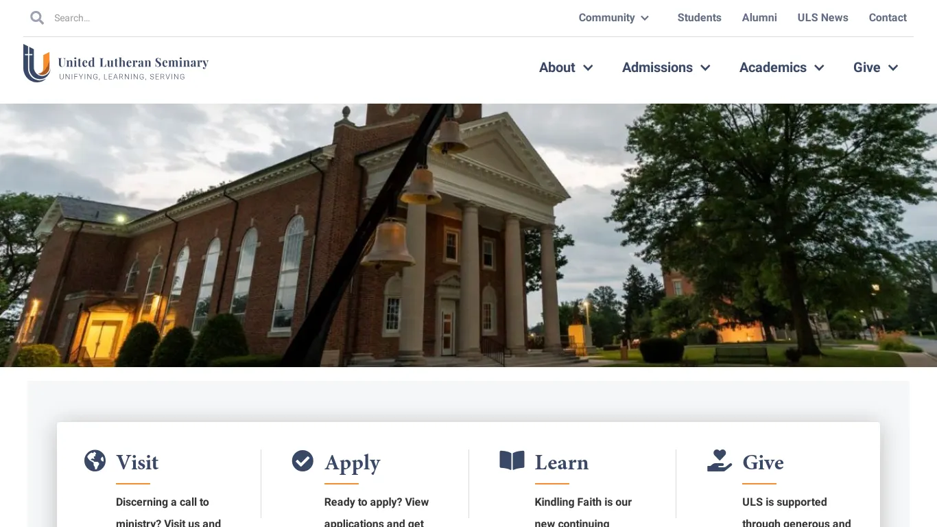
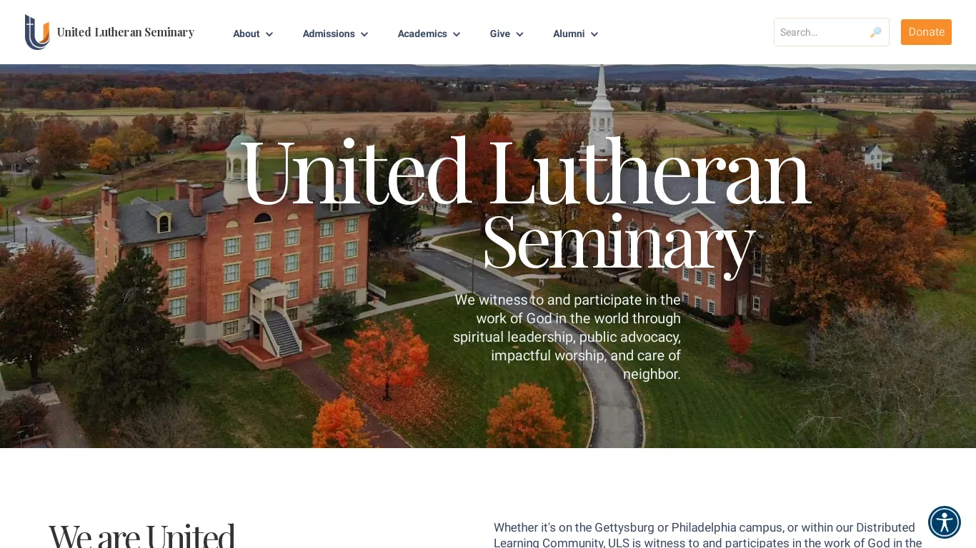
While the United Lutheran Seminary website was visually appealing and user-friendly for students, it was cumbersome for staff to maintain. The Webflow CMS, on which the website was built, was not designed with scalability and sustainability in mind. This was evident in the navigation elements, such as the global navigation bar and sidebar. If a page needed to be created, updated, or deleted, the staff had to make the same change across every page of the website, a time-consuming and error-prone process.

"I was very impressed with Nelson's work on our website redesign. He was able to create a website that is both visually appealing and easy to use for our students. He also made the website much easier for our staff to maintain, which has saved us a lot of time and effort. I highly recommend Nelson to anyone looking for a web designer who is experienced, professional, and reliable."
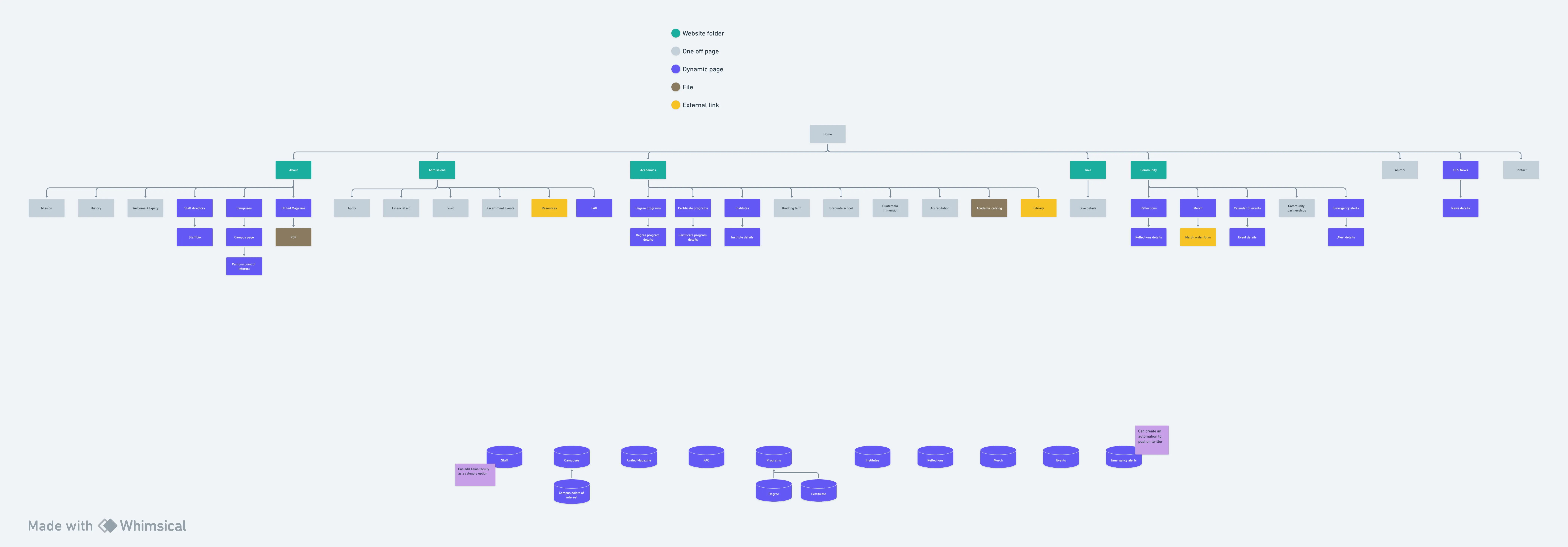
Nelson began the website redesign by using a Webflow template that was similar in appearance to the existing website but more modern. This allowed him to quickly create a new foundation for the website without having to start from scratch. He then focused on creating a new sitemap and Webflow collection structure that was optimized for both user navigation and staff maintenance. Lastly, Nelson created several tutorial videos for the staff to use as reference.
As a result of Nelson's efforts, the new United Lutheran Seminary website is both visually appealing and easy to use for students. It is also much easier for staff to maintain, which frees up their time to focus on other important tasks.







.webp)
.webp)
